Design Blog
Thursday, 11 April 2013
Final project: design process
This is the design process, documented with the use of print screen (screenshot in Mac OS).
I used paintbucket (Gradient > Paintbucket) to paint the canvas ("BackGround") a light violet colour.
I used Ctrl + V to paste the puzzle piece on a layer on top of the violet background. I named it "puzzle A."
Step 1: Background.
I used paintbucket (Gradient > Paintbucket) to paint the canvas ("BackGround") a light violet colour.
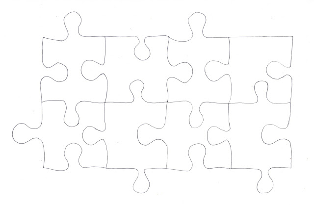
Step 2: Select puzzle pieces.
I opened my puzzle sketch in a separate photoshop window. Using the Magic Wand tool, I selected one of the puzzle pieces, then used Ctrl + C to copy the selected area.
Step 3: Adding the puzzle pieces.
I used Ctrl + V to paste the puzzle piece on a layer on top of the violet background. I named it "puzzle A."
Step 4: Completing the pattern and resizing.
I repeated steps 2 and 3 to complete the pattern. Each puzzle piece is pasted on a new layer. Next, I used the transform menu option (Edit > Transform > Scale) to resize the puzzle pieces.Step 5: Colour!
I used paintbucket to colour each puzzle piece (located on separate layers so there is no bleedthrough).Step 6: Background layer
I changed the background layer colour to a muted pale yellow.
Step 7: Layer effects.
I used Filter > Render > Clouds to add some texture to the yellow background.
Step 8: Layer Effects.
On top of the cloud effect, I used the burn tool to darken areas of the background.Final Project: Research and sketches
The topic for our final artwork is "Social Media Issues." As social media (including social networking websites and blogs) has become an indispensable part of modern life, various negative issues have come to be associated with it.
When brainstorming, i came up with these concepts.
Timesuck
According to urbandictionary.com, timesuck refers to an activity that is enjoyable but makes you neglect other, more important, things. Social networking websites like Facebook, tumblr, twitter and YouTube perfectly encapsulate the definition of timesuck.
Identity
Some people confuse their personal identity with their online persona. They are overly dependent on their social media accounts, sometimes to the extent where their online persona resonates more than their actual identity.
Connection/Disconnection
People strive for connection- we want to feel that someone else out there understands what we're going through. However, sometimes in our pursuit of connection (via social media), we disconnect from the people around us.
Thursday, 4 April 2013
Colour research
Colors can be classified as primary, secondary or complementary. Primary colors cannot be produced by mixing one or more colors. They are Red, Blue and Yellow. Secondary and complementary colors are created by mixing primary colors in various proportions.
My favorite color is PURPLE. On the color wheel, Purple, a secondary color, lies between the primary colors Blue and Red. Various shades of purple are achieved by varying the amounts of blue and red in the combination.
History
Purple dye was produced in the Mediterranean from the shells of the murex, a small mollusk (Kurlansky, 2002, p. 75).
Tyrian purple is believed to have been produced for trade as early as 1500 B.C. (Kurlansky, 2002, p. 76). As the process of creating the dye was laborious and time-consuming, the color purple came to be associated with wealth and prestige; ancient Romans such as Julius Caesar and Cleopatra were associated with the color. Cleopatra’s warship sailed with dyed purple sails (Kurlansky, 2002, p. 76)
Shades of purple
Purple ombre cake
Lilacs
Lisanthus
An aubergine, or eggplant
Pantone 2685 C
Cadbury owns the exclusive rights to this shade of purple.
Pantone 525C
I like the color because it is the perfect blend of the cool tones of primary blue and the warm tones of primary red. Purple can be used to represent good or bad, and is a rich, vibrant color. The various shades (ranging from lilac to dark aubergine) can be used to depict various moods and feelings. I prefer red-dominant purples, like the pouch above.
Abstract art
An abstract piece featuring a cool color gradient. The different colors were blended to give a marbleized effect using the smudge tool.
Class exercise: Shading and Smudge tool
We used the Elliptical Marquee Tool to create a sphere, the coloured it in. I overlaid a darker shade of grey along the outer edge of the sphere, then used the smudge tool to blend the colours together, which resulted in this marbleized effect.
Then, I added a shadow using the Mixer brush tool in 106px and 54% hardness.
Tutorial 2: Coloring and Painting
For this tutorial, we had to use Photoshop tools to color in a pencil drawing of a horse.
I outlined the drawing following the pencil lines, then coloured in the horse using 'Paintbrush oval 45 Pixels' from the Brush tool options. I used shades of grey at various opacities to add colour and dimension.
I outlined the drawing following the pencil lines, then coloured in the horse using 'Paintbrush oval 45 Pixels' from the Brush tool options. I used shades of grey at various opacities to add colour and dimension.
Subscribe to:
Comments (Atom)


